Client
Honey Moon
Location
Neverland
Services
Research, Website Design, Content Strategy
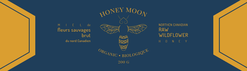
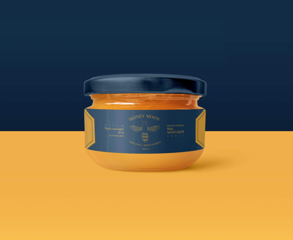
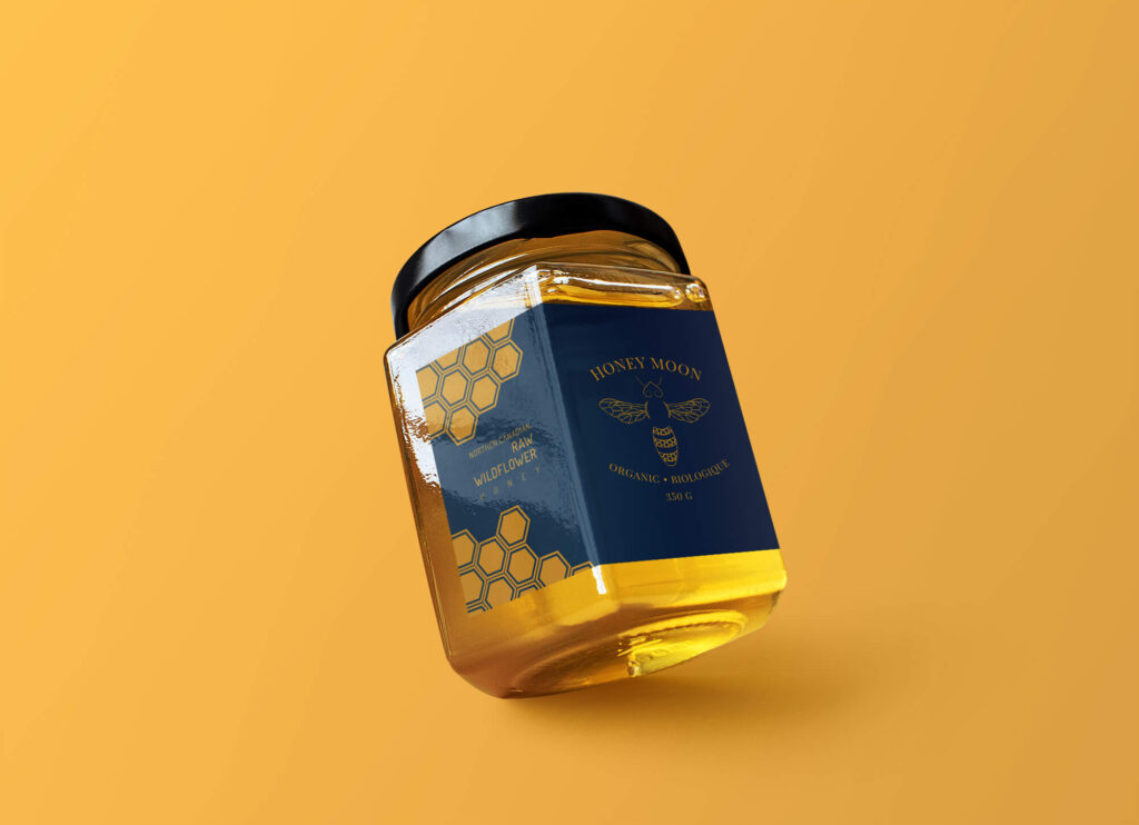
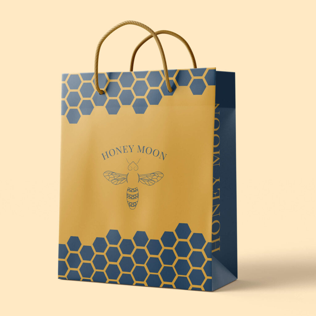
Honey Moon is a personal project designed for fun and creative exercise. While it started as a conceptual design experiment, the goal was to create a unique honey label that embodies both the love for honey and a distinct brand identity. The project reflects a passion for the product and serves as an opportunity to explore brand creation from scratch.

The vision for Honey Moon was to capture the essence of honey through a creative, appealing label design. The design focuses on a blend of warmth, nature, and elegance, showcasing the purity and richness of honey in a way that speaks to both the aesthetic appeal and quality of the product. The label’s color palette, typography, and graphical elements were carefully chosen to evoke a sense of natural sweetness and timeless beauty.


Honey Moon, although initially conceived as a personal project, demonstrates the ability to create a unique and compelling brand identity from scratch. The label serves as a creative exercise in branding and design, reflecting a personal love for honey and an exploration of how to convey that passion visually. This project shows how a simple concept can evolve into a polished, marketable product design, ready for any manufacturer who shares the same vision.
